
I thought it would be fun to compare some of the different books I have - sizes, print quality, and format options.
First, here is the new book I got - 8x8 inch book from Shutterfly book on the left, next to the similar 6x6 inch book from ArtsCow on the right.

The ArtsCow cover printed a bit darker than the Shutterfly cover. Here is another look at that.

The back covers show a huge difference. In the Shutterfly book, the dark paper has been lightened substantially. I've seen this before in another Shutterfly book with a dark cover. I think their software is applying some kind of correction to the back cover.

Here is a comparison of different sized books: 12x12 vs. 8x8 vs. 6x6.

After seeing them all together, I've decided that 6x6 is just too small. I know some people think 12x12 is too large, but it is still my favorite. But for smaller gift books, I think I will stick to 8x8 in the future.
Here are some more size comparisons. It is interesting to compare the 12x12 and the 6x6. Although the length and width of a 6x6 are half that of a 12x12, the area is one quarter the size.

And here is the same size comparison for the 8x8.

In my post about my little ArtsCow books, I mentioned that the printing was a bit red. It was most noticeable in the skin tone in photographs and in this page with a gray background. Here are some comparisons to show that. Shutterfly vs. ArtsCow:

Shutterfly vs. Blurb: (this photograph was taken on a different day with different lighting conditions)

But here are all three together. Blurb vs. Shutterfly vs. ArtsCow:

Finally, I wanted to compare the spine. Both the Shutterfly and the ArtsCow books have spine areas with a very large overlap onto the front and back covers.

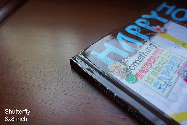
In the ArtsCow software I could simply type in my spine text. For Shutterfly I had to make an image to drop in. As you can see, my spine text on the Shutterfly book ended up being too big. I also chose a brown spine on the Shutterfly book to try to blend in with the dark brown background paper.
In comparison, the Blurb book spine area only wraps onto the cover about 1-2 mm. I really like this. If I remember correctly, in Bookify (Blur's online book creation software) the spine is simply typed in. Which is what I like - it's easier to just type something in than to actually design a spine.

One final thing: my Shutterfly books have a strong unpleasant smell that I have not noticed with Blurb or with ArtsCow. It does dissipate, though, so that's good. (I am particularly sensitive to smells.)
Thanks for stopping by!
Thanks for sharing this Amazing Blog. Shutterfly always delivers when it comes to personalized gifts! If you're planning to order photo books, calendars, or cards, don’t miss out on the Shutterfly Promo Code $20 Off. I used it on my last order and got an amazing deal. Quick, easy, and perfect for saving on meaningful gifts!
ReplyDelete