welcome

Welcome. This blog is my little home on the web. It's mostly about my favorite hobby, digital scrapbooking. You might also find some recipes, home decor projects, or parenting woes. But mostly digital scrapbooking.

Saturday, May 28, 2011

Sleeping Alone & New Layouts - May 28, 2011

Well, we got the big desk out of the office (actually the big desk was demolished), and Miller is all moved into his new "apartment." It's pretty sweet, with its own kitchenette and everything. All of his stuff which used to be placed all around our apartment is now in one room. I think it's pretty awesome. And I have some decorating ideas too. I'll be scrapping all about it soon.

He even sleeps in there. The first night he made it til 3am, then the next night 5am, then 3am again. He simply came into our room on his own when he woke up. Last night it was 1 am and he started calling for me instead of just walking in. I wonder what tonight will be.

Here is a layout about it ...
Photo and Journaling Starters by Scrapping with Liz; Papers from Curiosity
by Joyce Paul; Pretty Little Poppy by Captivated Visions; Happy Garden by
Gina Marie Huff; Pin from NSD freebie from Kitschy Digitals

And another about one of his favorite games, Spider-Man Scares the Kids (or Black Widow Spider Scares the Kids or Big Red Snake Scares the Kids, etc.)
Summer Template by Tiffany Tillman; February Freebie by Dream's Place
Atelier; Everyday Life #3 by Cinzia Designs and Gina Marie Huff;
Stitches no. 1 by K Studio

And I've been getting caught up on Project: Love, Me pages
Everyday Life #2 by Cinzia Designs and Gina Marie Huff
Cardstock from HoHoHo by Miss Tiina
Story tellers 1 by Joyce Paul; Everyday Life #2 by Cinzia Designs
and Gina Marie Huff; Date element from Dare 2beU by Cinzia;
Worn Photo Overlays 3 by Something Blue Studios
Everyday Life #2 by Cinzia Designs and Gina Marie Huff
Cardstock from HoHoHo by Miss Tiina

Thanks for stopping by.

Saturday, May 21, 2011

CA State Fair - Award of Merit!!!

I'm so excited!! At the last minute I decided to enter two digital scrapbook pages in the CA state fair, and I just got the letter informing me that one of them received an Award of Merit and will be on display at the fair!

The judging criteria required
  • a two page spread
  • at least four photos
  • the photos should be the focus of the page
  • elements should support but not compete with the photos
  • the journaling should give the who, what, where and why 
  • bonus for using color
This page was entered in the "Travel" category, and received the Award of Merit.  Yay!  And I'll get a ribbon, too! Click on images for larger pic.
Fancy Circles templates by Scrapping with Liz; Patterned paper from He by
DeCrow Designs; Cardstock by SuqyQ Scraps; Seaside Fall by Ziska
Advent Freebie by 3 Paper Peonies; Photo Action by My Four Hens

The only comment by the judge was that she (I'm guessing a woman based on her writing) loved the shadow pictures.

There was also a "Family" category, and I entered the following page, about getting Miller caught up on vaccines after having postponed them.  The judge left comments:  "great story, 2nd page - hard to read at bottom, lots of empty space" I will often cover text with embellishments, and the scientist has made negative verbal note of this on several occasions.  I had suggested moving the subtitle of the page so it didn't obscure the text beneath, but he actually thought I should go with my own true style.

Baby Album Templates & Zine Style by Scrapping with Liz; Neutral Freebie
by Three Paper Peonies; Stitches by K Studio; Propitious Perse
by DeCrow Designs; BG and bow from SO June Journey Mega (recolored)

Sometimes I design pages to go opposite each other in my album, although I do not think of them as two page spreads.  That was the case for all of these pages.  They were all designed separately, but intended to go side-by-side.  So I actually made some small adjustments to them to create more cohesive two-pagers.  Here are the originals:


For the Lighthouse page, I created a common top margin, and for the Vaccine page I removed the circle doodles on the right side.  I also edited some of the text to read better.

So see you at the fair! I'll be braving the heat this year to get my picture next to my winning entry :)  And I'll probably go look at the goats too, because well, I adore goats.  (My parents raised goats when I was little.)

Friday, May 20, 2011

Co-sleeping & New Layouts - May 20, 2011

Tomorrow is a big day ... we're going to IKEA ... taking the first steps to *possibly* moving Miller into his own room. Dare I dream of no more sharp pointy toes and heels pressing painfully into my side while I sleep? I'm sure it won't happen over night. Right now all we're planning is to move the "big" computer out of the office so that it can become Miller's room. That's all for now, but it's a big step for us.

So that's the big news. The little news is I have a couple layouts to share. This first is a layout that I've had in mind for a while.  We play Mr. Potato Head a lot, and there is one set of eyes that I think are supposed to be feminine, but always just look evil.  They make me laugh every time.  I was also inspired because several months back I had opened up a "scrapbook" of sorts from my college days, which just contained clippings (aka scraps).  Clippings of comic strips from the school paper, photos of strange looking people (also from the school paper) and little ads for "as seen on TV" products.  It reminded me that scrapbooking can just be about the little things that amuse you.

Everyday Life #3 by Cinzia and Gina Marie Huff; Cardstock by Cafe J;
Photography Frame by Joanne Brisebois; Photo Action by My Four Hens

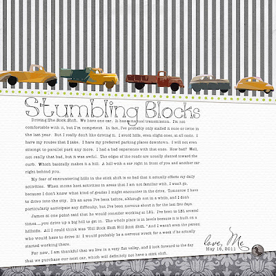
I'm about a month behind in the Project: Love, Me album.  I'll be trying to catch up over the next few weeks.  This one was about stumbling blocks or things that hold you back.  I chose to write about my never ending fears about driving our manual transmission/stick-shift car.  The cars and trucks were photos of 3D objects, and I used a Photoshop filter on them because I didn't want the 3D look.

Space Between Vol. 14 Template by EH Studios; Cardstaock from HoHoHo
by Miss Tiina; Everyday Life #2 and #3 by Cinzia and Gina Marie Huff;
Trucks from My Favorite Things by Gina Marie Huff

Thanks for looking.

Monday, May 16, 2011

Photo Edit

I thought I would share a little photo edit that I did for one of my layouts. I had originally thought there were some problems with the photo myself, but I was lazy and figured it didn't matter. But then when I showed my layout to the scientist, he clearly did not understand my layout. Here is the original layout, with the unedited photo.

"An Unlikely Pair"

I think my husband thought the "pair" was my son and the piggy bank.  But what I really meant as the "pair" was the piggy bank and the alien riding on top.  My son in the background is distracting.  Even though the alien is green, he almost disappears from the photo, I think because of the bend of the arm behind him - the eye just blends him into that shape, and the brightness of the pig and my son's tummy take over visually.  However, I actually like that my son is in the background, because, well, he was actually playing with these toys at the time, and that's what inspired me to take the photo.

My first thought was to try to blur out the background, and the scientist thought I should darken the background.  I did a little of both.  I used the Quick Selection tool to select the background elements in the photo.  I did a Gaussian blur of about 5 pixels, and added a low opacity gray fill layer to the selection.  Here is the before and after:


I think this is better. My son's presence is still there, but a bit muted.  Green alien gets his spot as one of the stars.  Hopefully, the idea I'm trying to communicate with the layout is more clear.  And best of all, I got to play around in Photoshop a little!

Friday, May 13, 2011

Digi musings and New Layouts - May 13, 2011

Today I dropped off two submissions for the California State Fair scrapbook competition. I'm trying not to get too excited, though. From reading the contest guidelines, it definitely sounded like the judges are expecting traditional, paper layouts. But I think my submissions are strong ones, so I have a little flutter in my belly. I believe the judging is next week, so hopefully the wait will not be too long.

Today was also the last day to apply for the Scrap Orchard creative team. I didn't apply. But I kind of wish I did. The scientist would not be happy if I did. I keep telling myself that I enjoy scrapping without deadlines, that I like being rogue. I have a feeling that some of the girls on one of my teams will be picked to be Honey Bees, and I will be envious. Of course, this way I'm spared the pain of rejection.  I just gotta stop thinking about it.  Good luck, girls!!

After a bit of a dry spell, I've got on a roll again. Five layouts to share!  I've had a folder with photos set aside since the beginning of the year, and I was beginning to think that they might never get scrapped.  I think my main obstacle was that the photos themselves just weren't very good.  But then I gave them a new look, and with some of my NSD purchases, got them scrapped.

For a while Miller was really into using tape to make things....taping paper spiders together, or just prcacticing pulling the tape out of the dispenser, or in this case, creating a scotch-tape spider web all across the office.
conversation piece no. 5, The Sunday Edition and Pictures + Words
all by Paislee Press

Miller can make anything into an action figure, even his piggy bank.
time capsule and billet doux by One Little Bird

Just a little field trip with my mom's group.
patterned papers from EverydayLife #3 by Cinzia and Gina Marie Huff;
bugs from A Haunting We Will Go by Gina Huff and Patricia Christensen;
solid paper from Innovative by One Little Bird

Ever since my pregnancy, I have not been able to wear my wedding rings, which I love dearly.  Even after the pregnancy weight was lost, they still did not fit.  I think my bones are literally bigger now. Thank you, pregnancy hormones. But I thought I came up with a clever twist, to say that motherhood itself has made hands strong and big.
Everyday Life by Gina Marie Huff

Just a series of photos when I was bugging Miller to cut his hair.  I styled his long bangs in different styles and even gave them names, which I can't remember anymore.
paper from Innovative by One Little Bird;
Frames from pictures + words by Paislee Press;
Wordart from EverydayLife 2 by Cinzia and Gina Marie Huff

That's it for now, I'm actually at my mom's house right now, to celebrate my niece's birthday on Sunday. Have a good weekend!

Monday, May 2, 2011

New Layout and The Stupid Things - May 2, 2011

Yesterday, we opened the Disney Mater's Tall Tales DVD.  After popping the DVD into the machine, the DVD said it would start the Autorun feature.  I thought - great, I can just walk away.  Well, the Autorun feature plays all of the advertising and previews, and takes a great feat of remote control button pushing to get past it all once it has started.  I was furious.  On regular DVD's it is fairly easy to skip past the advertising.  But on children DVD's it's practically impossible.  I was quite peeved.

This morning Miller told the scientist that he wanted to watch "the stupid things."  I overheard a little of the conversation, and I have to admit I was baffled, but I was busy getting ready for a Mother's Day Tea.  However, James quickly figured out that "the stupid things" meant Miller wanted to watch his DVD, including the advertising and previews at the beginning. Apparently I was saying "these stupid things" over and over again as I pushed buttons on the remote trying to skip through the ads.

I only have one layout this week, but I'm really in love with this one.  A while ago, the scientist went to a hardware store to buy stuff for his lab.  He took Miller with him and Miller came home with a small, real, tape measure, which has been named "Superhero Yellow Stretch."  It's just the cutest name, isn't it?

Wavy Text Paths by Scrapping with Liz; Paper and button from Delight
and Amiable by DeCrow Designs; Paint and doodle from Life is Good by
Gina Marie Huff; Frame from The Promise of Tomorrow by Leora Sanford
Clouds from Some Stuff Template 11 by fei-fei's stuff

By the way, Stretch is the name of the tape measure on the Handy Manny cartoon. I'm looking forward to NSD. Gonna do some shopping!